Every year, the Bluethumb mentorship program develops a challenge for the creatives and their respective interns. At the end of the program, they are asked to present and the best pair is chosen based on Bluethumb’s process of problem solving which is a combination of strategy, functionality and design.
For 2016, our team was tasked with picking different government institutions and creating design solutions for them. The team that won, senior designer Chino and his partner intern Martel took on the Philippine National Railways.
To give you a little background, the Philippine National Railways is the oldest train system in the Philippines. During its golden days, ordinary Filipino commuters would depend on it to take them from the country’s capital down to as far as the south eastern part of the Luzon island. Unfortunately, neglect from the past administrations and damages brought by natural calamities ruined efforts in bringing back the luster PNR possessed in its heyday. Today, the entirety of their operations is inefficient and inconsistent, from the stations’ layouts all the way to the trains themselves.
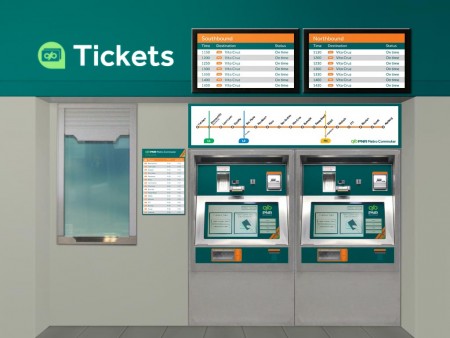
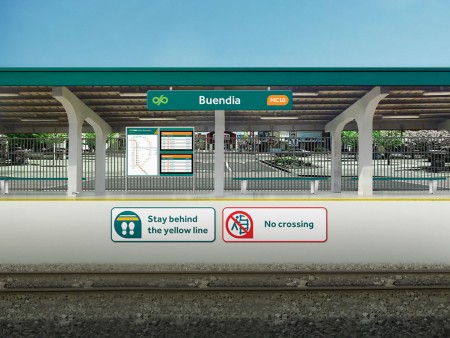
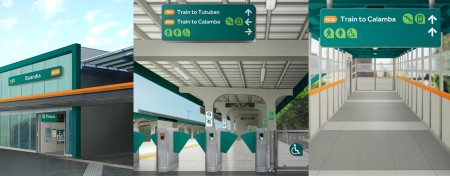
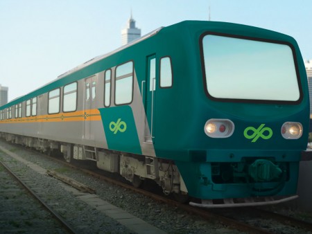
Through this challenge, the winning team was able to shed light on the flaws of our public transport. What Chino and Martel focused on was the interaction between the train station and the commuters. “One way to help (the PNR) is through branding and design that work” says Chino.
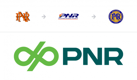
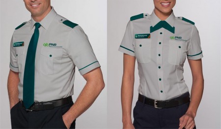
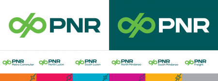
From the identity elements all the way down to the applications, the PNR was pulled into the present and given a more contemporary and stable image. Like other good design solutions, theirs didn’t just happen overnight. A lot of research, including experiencing the PNR themselves, went into the creative process.
“As much as I already had an idea about what the PNR is and what it’s like, there’s nothing that can beat personally going through the PNR experience. Seeing how people are inside (and outside) the trains and how things are in the stations really have me insights as to how the PNR experience can be improved. I realized how hard it is for a first-timer to understand how the PNR operates because even if there’s a lot of existing information like train arrival schedules, maps, etc., they are not presented in a way that would be easy to understand. One could easily get on the wrong platform or miss the train stop, but these issues can be solved to make the PNR experience better.” recalls Martel.
When asked about what his main takeaway was from this project, Martel responded “Design is not merely aesthetic, but it really is a discipline that aims to make the experience of things that work better. Design takes into consideration the people that will be targeted or affected by the output, with the hopes that it can improve their experience.”
“Good graphic design solutions to communication problems can improve the flow of information in society and, therefore, substantially and positively affect education, social well-being and the daily enjoyment of life. In addition, good graphic design solutions can also have a positive economic impact.”
—Jorge Frascara, Visual Communicator
Is this a great idea?
Tell us what you think!
Connect with us at hello@bluethumbcreatives.com
