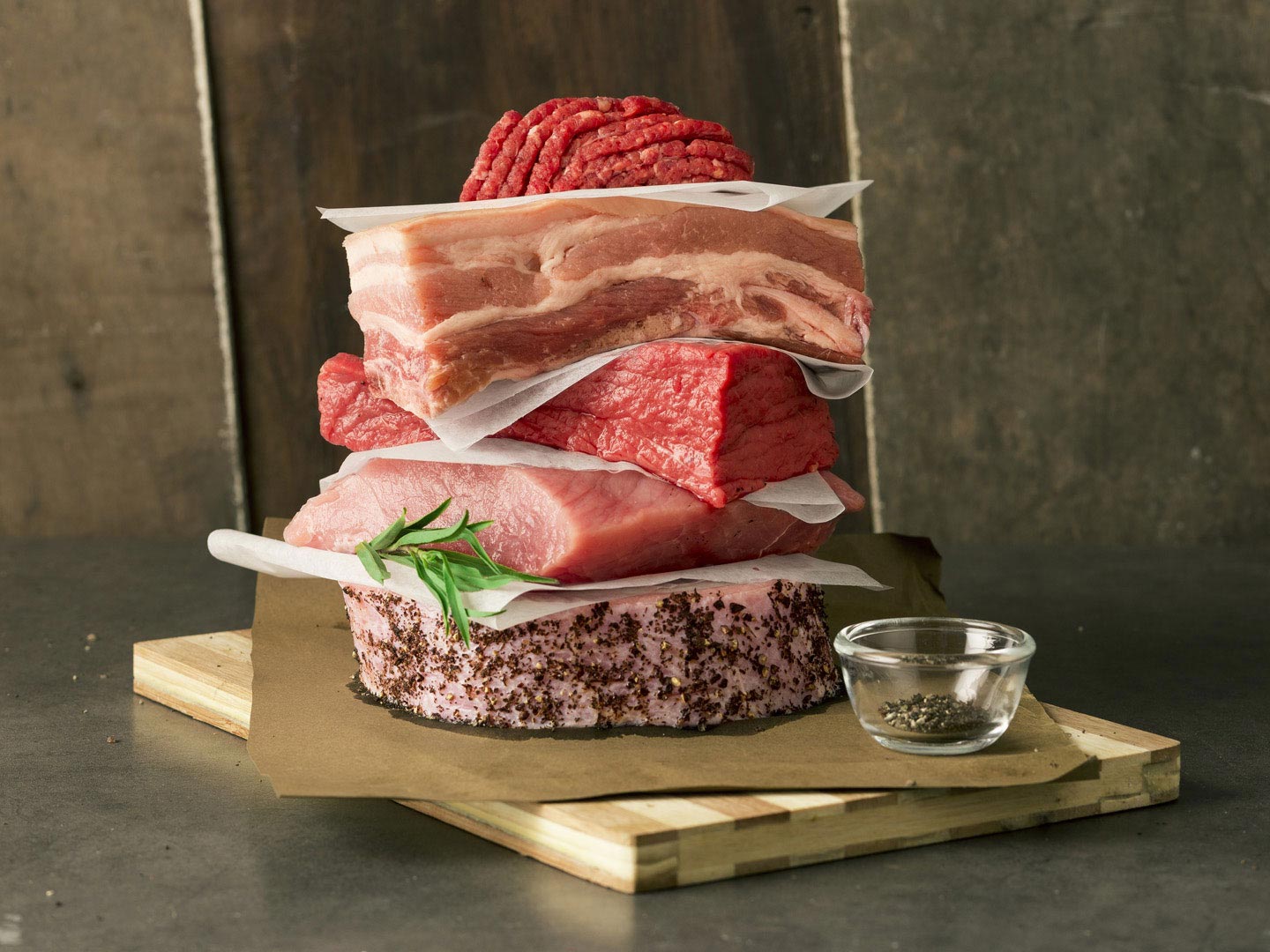
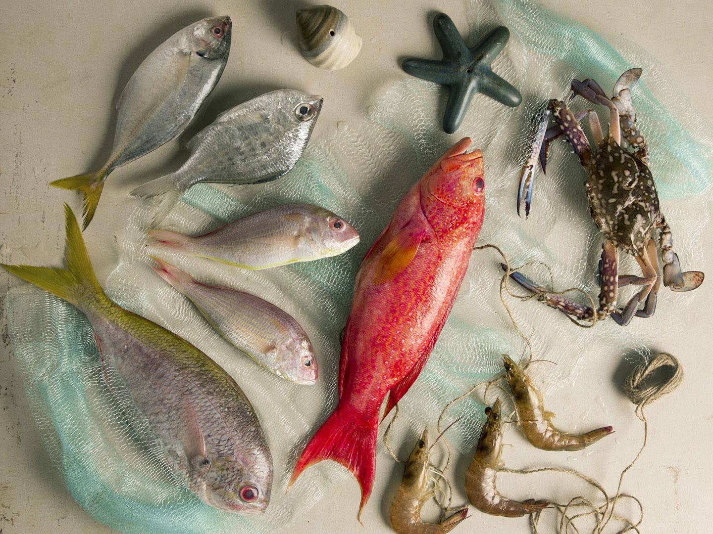
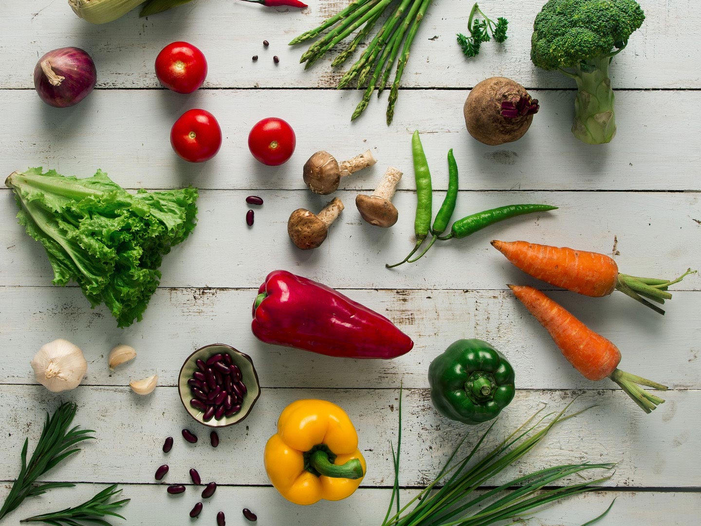
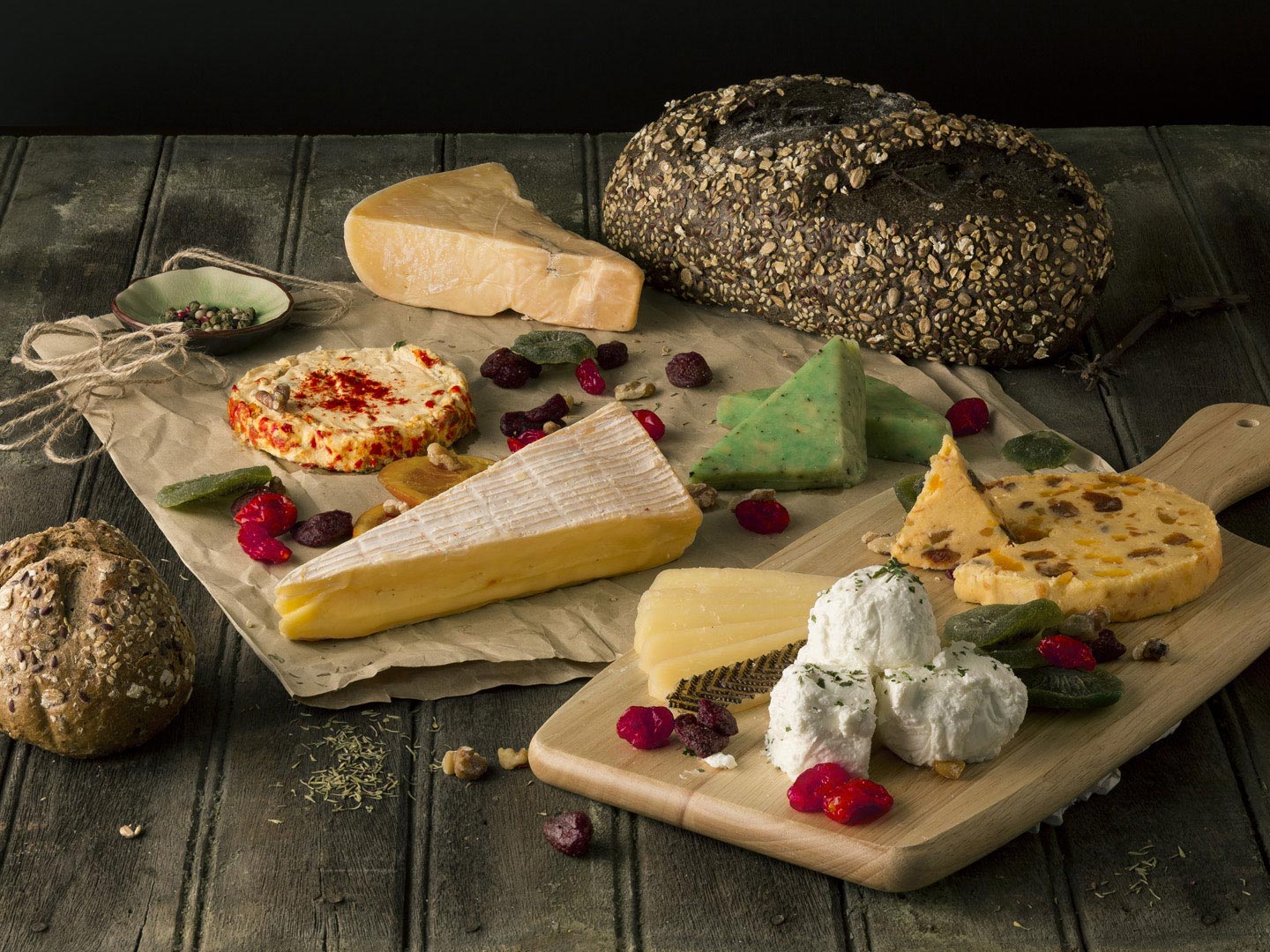
Curated groceries
More than just groceries
In these modern times where people are more health-conscious than ever, the brand needed to position itself as a grocery store that can provide not just for the needs of its discerning customers but can also keep up with their lifestyle and preferences.
A befitting identity
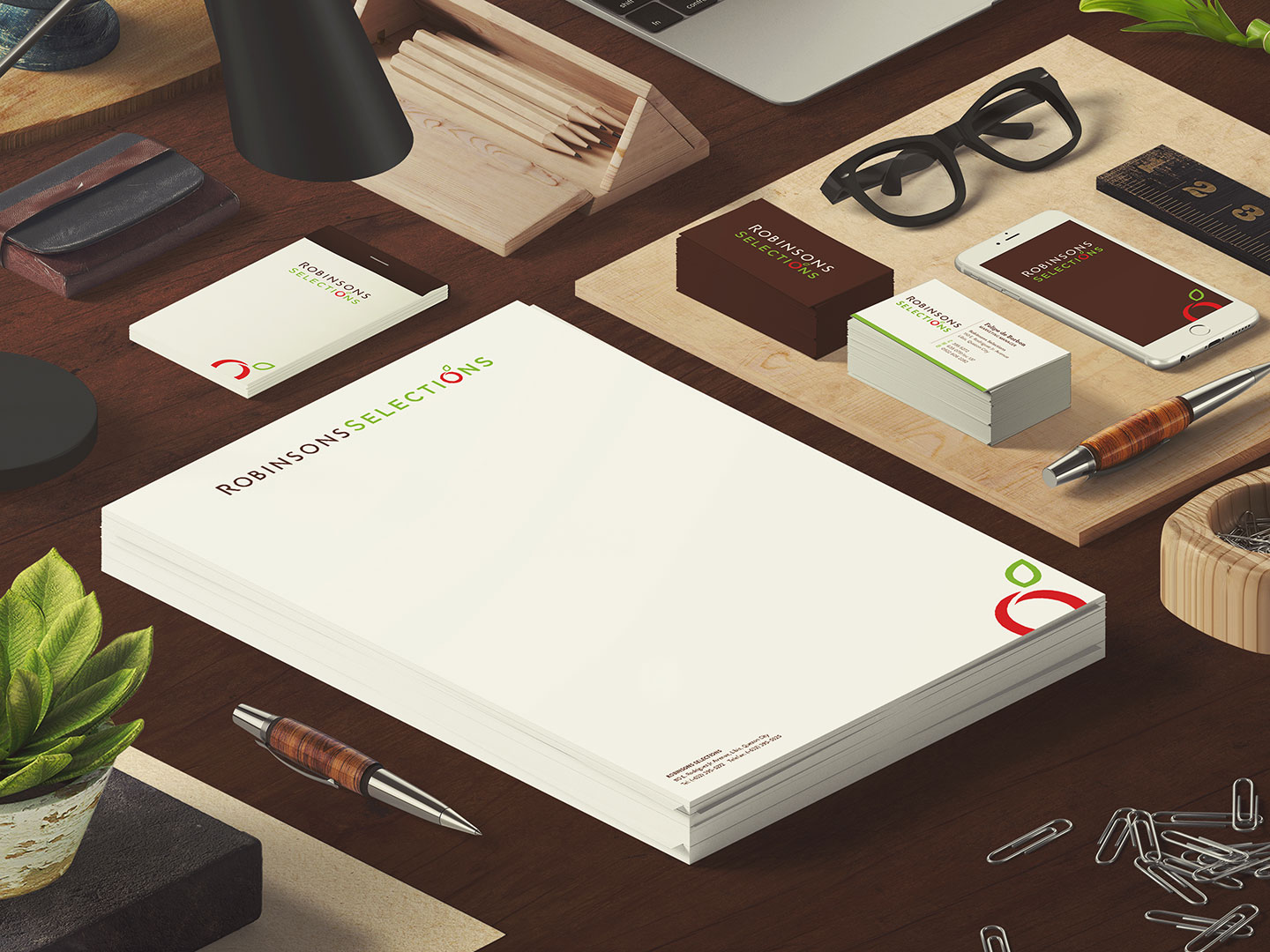
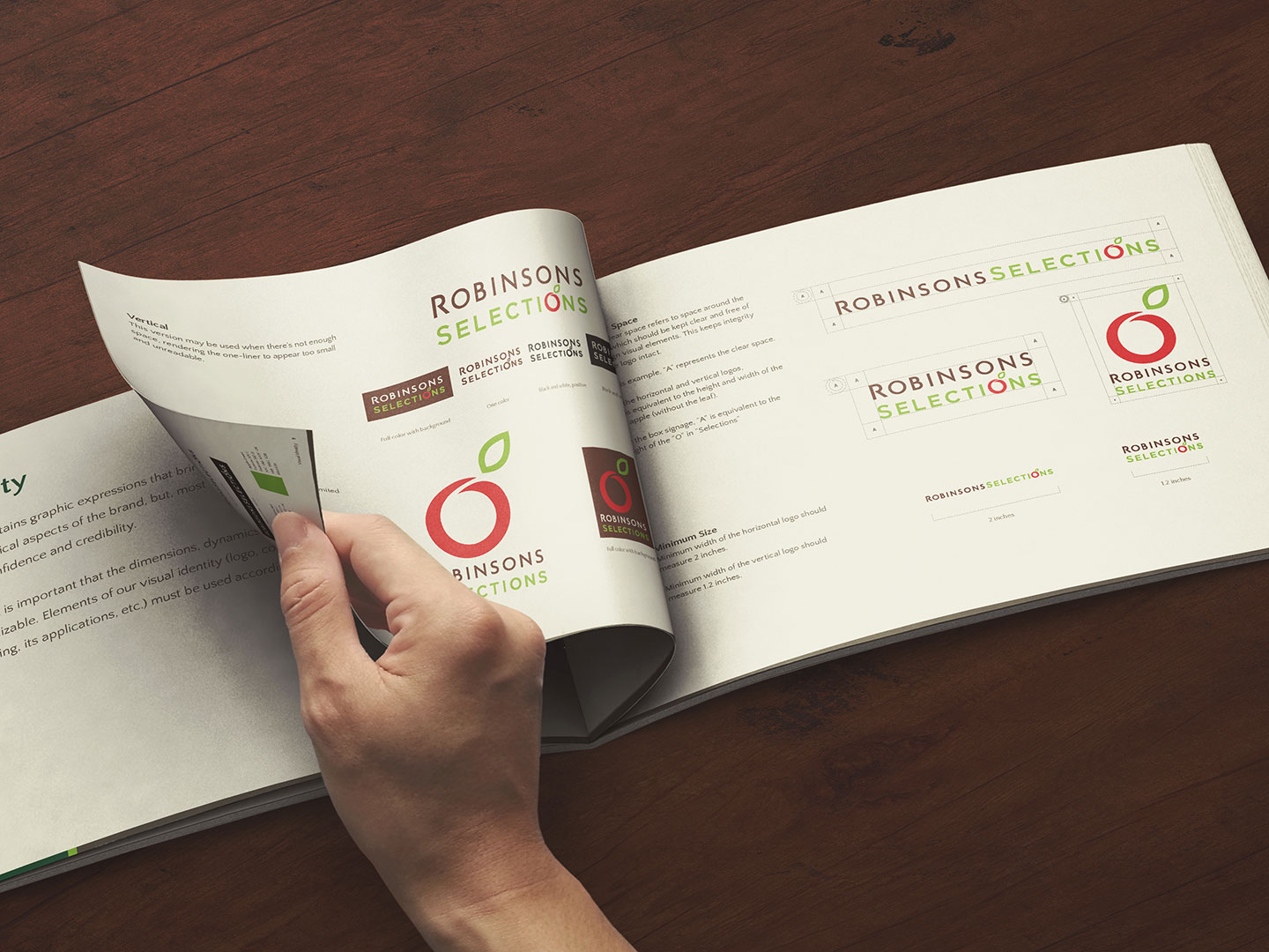
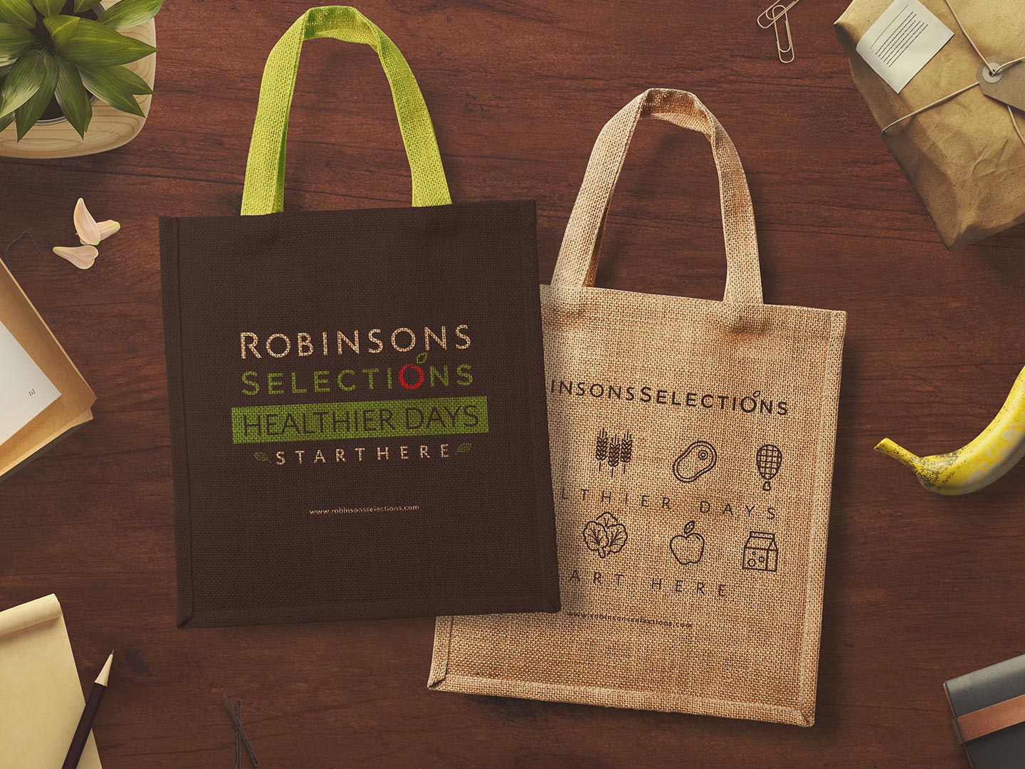
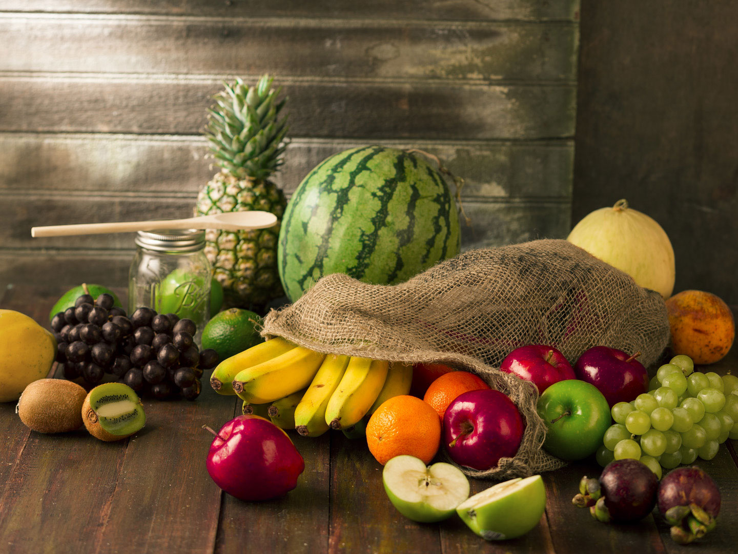
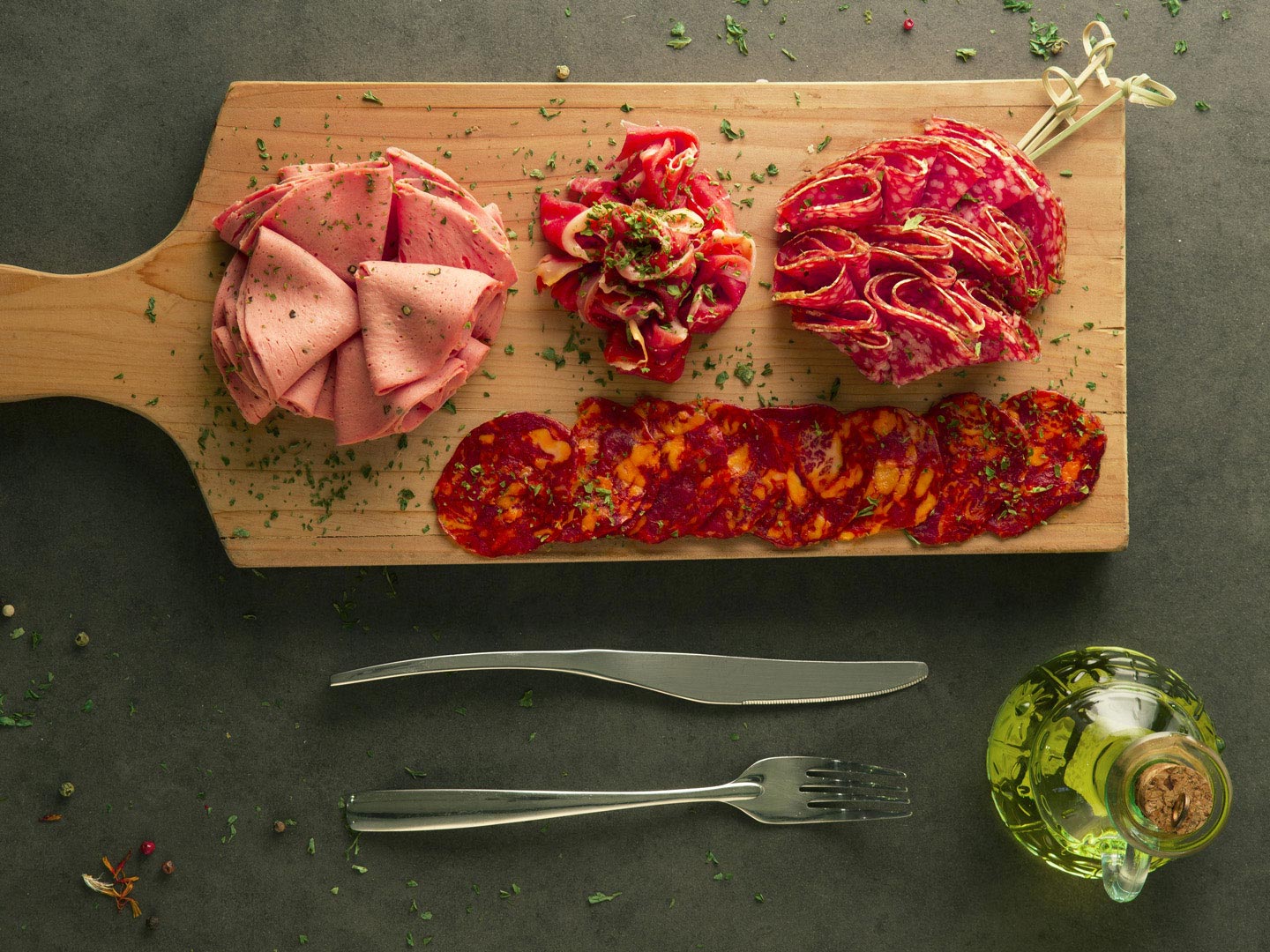
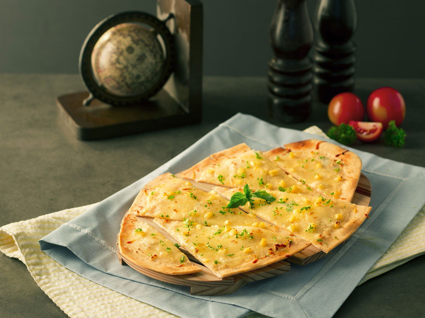
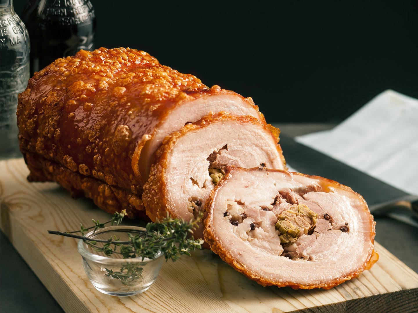
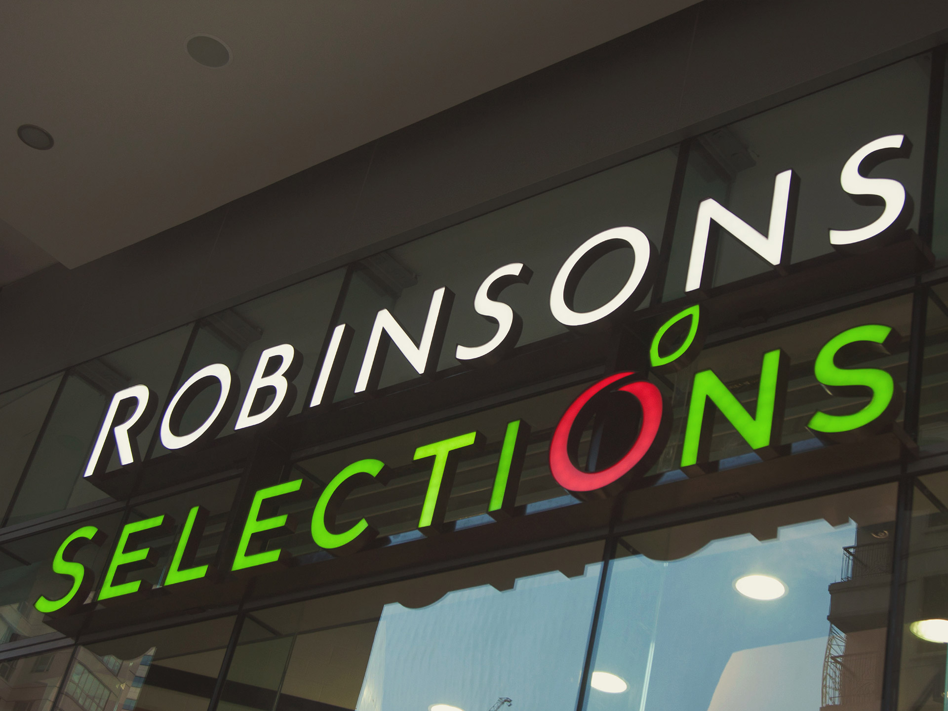
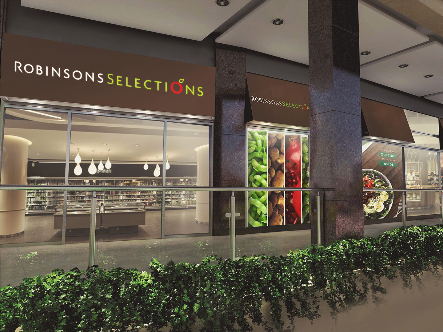
We looked at what made the brand different: a grocery store that carefully curates its products. We came up with the name “Selections”—emerging from the idea of selecting only the best products locally and internationally for their customers.
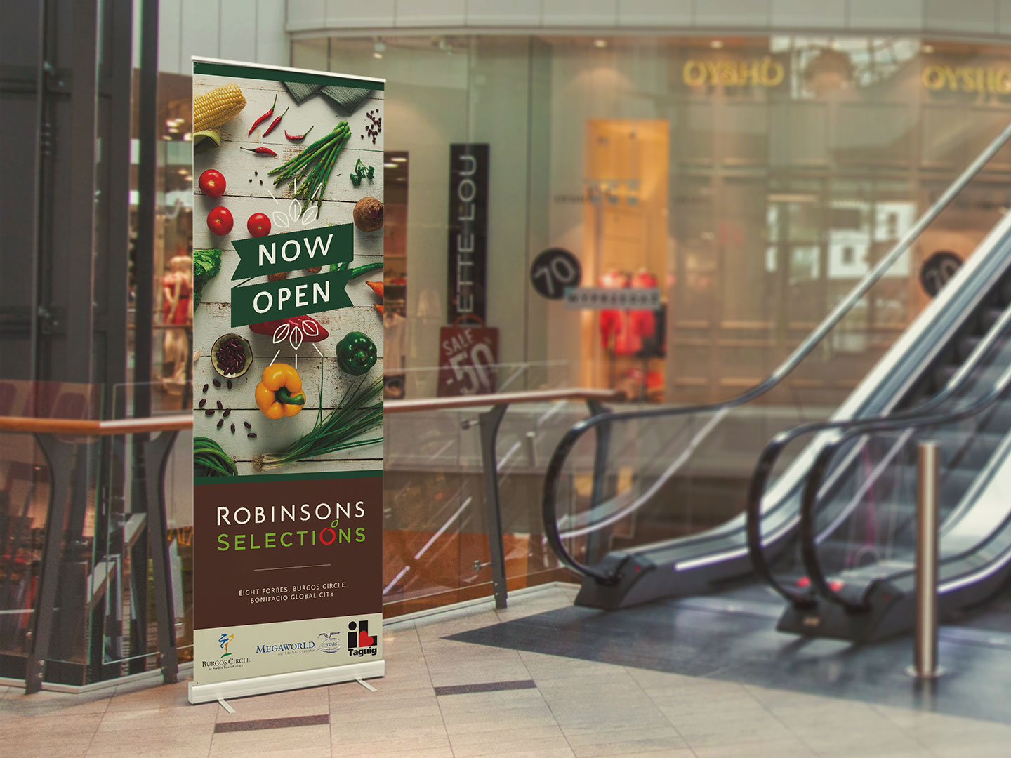
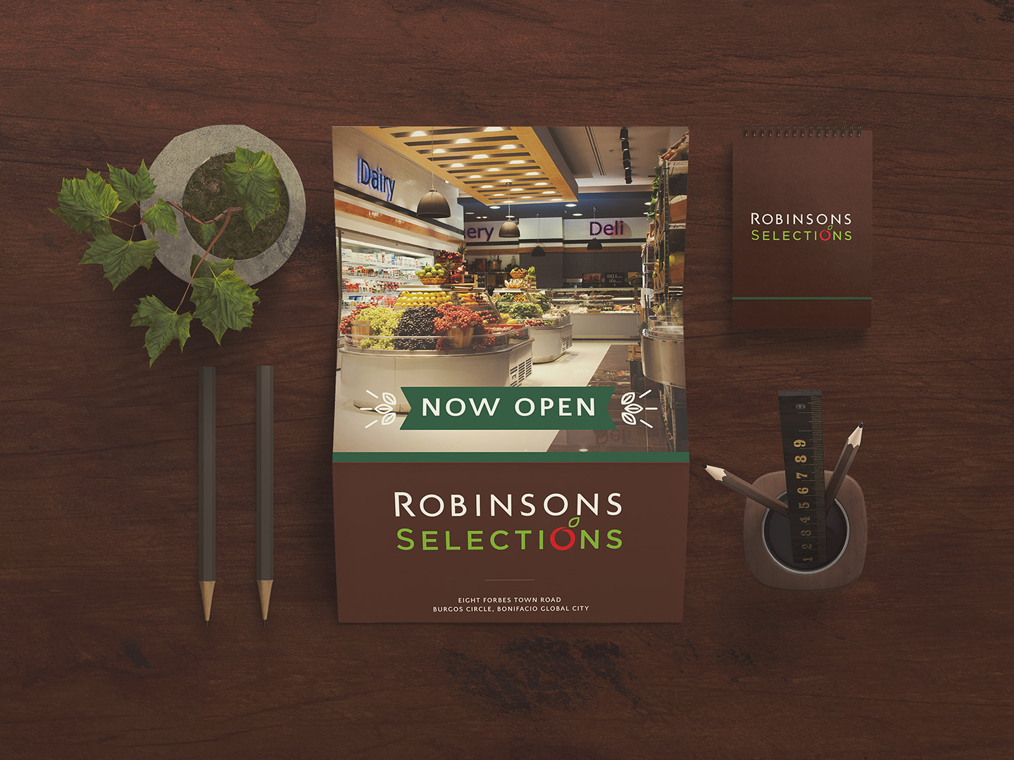
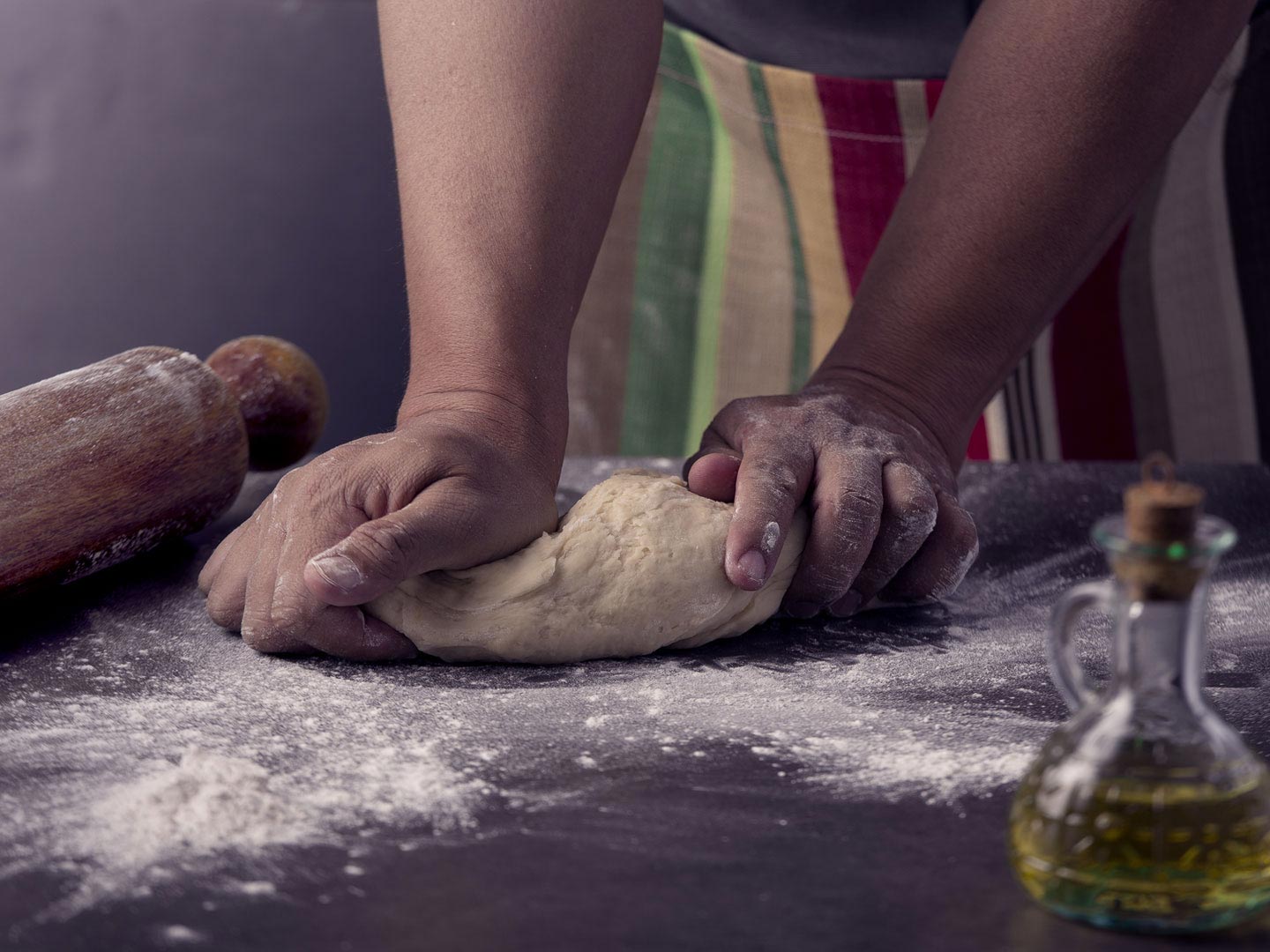
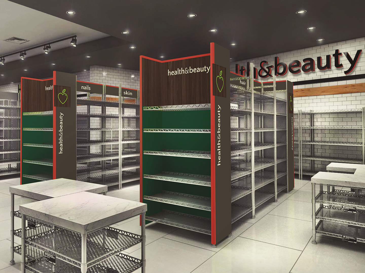
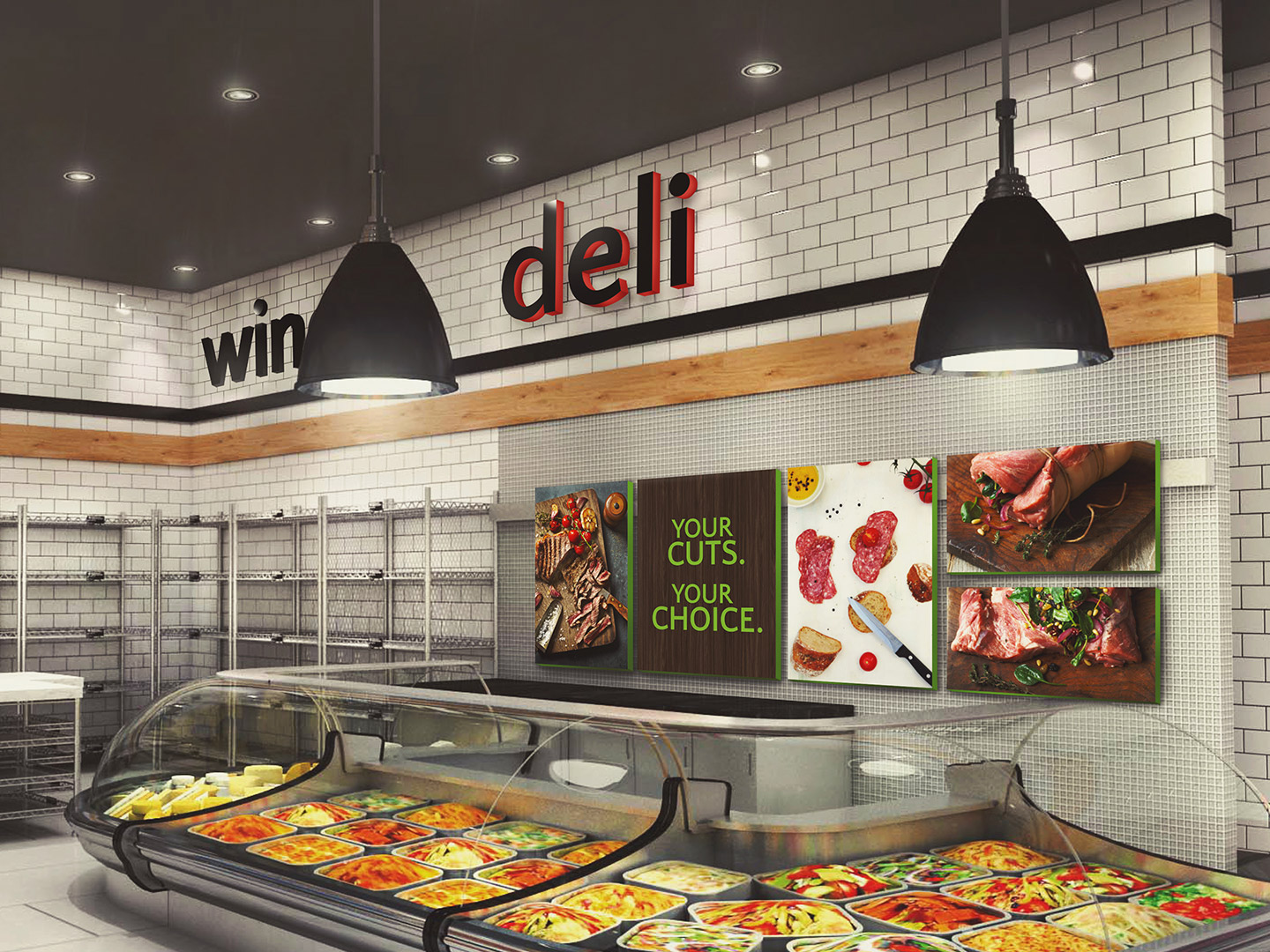
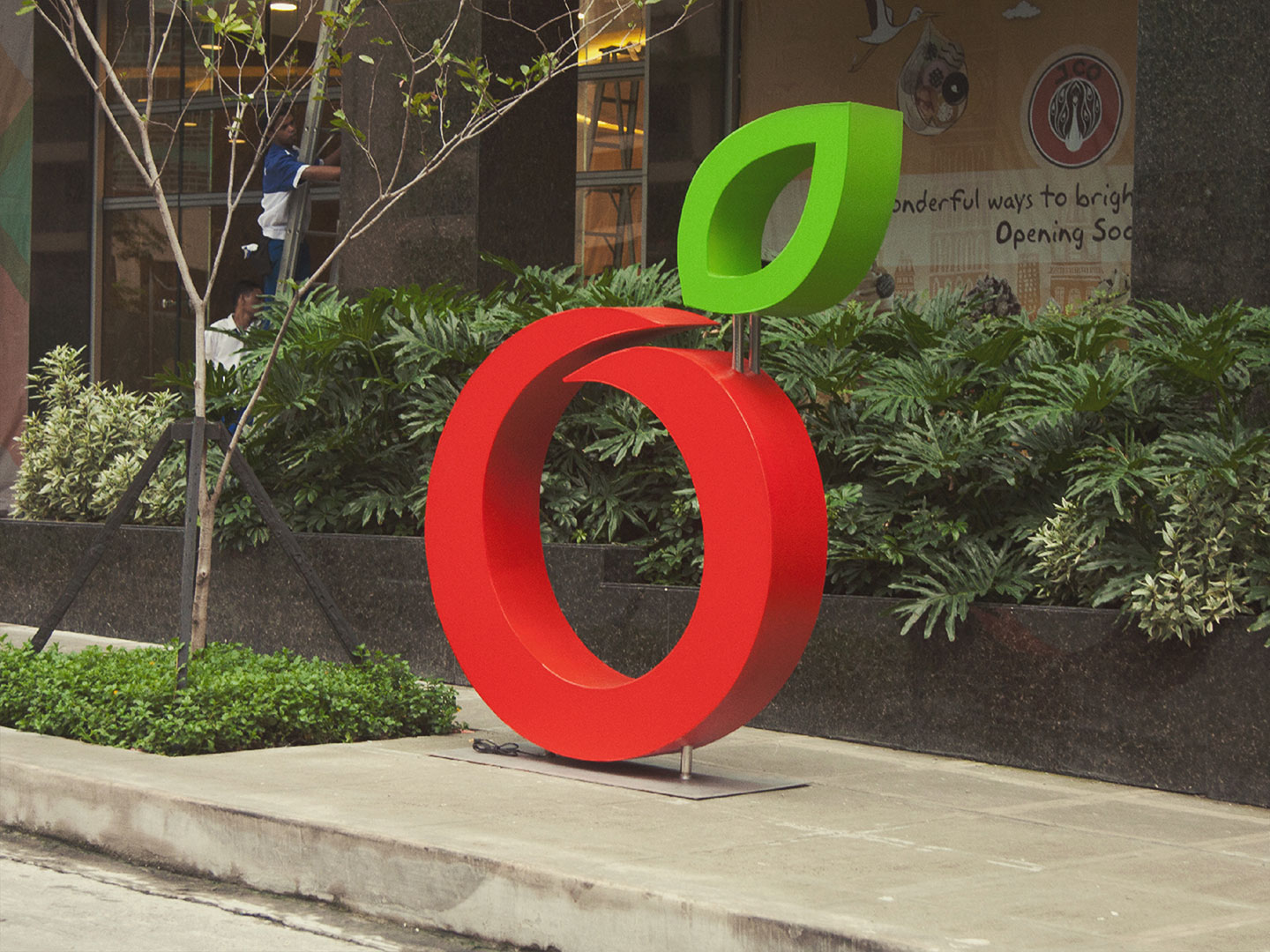
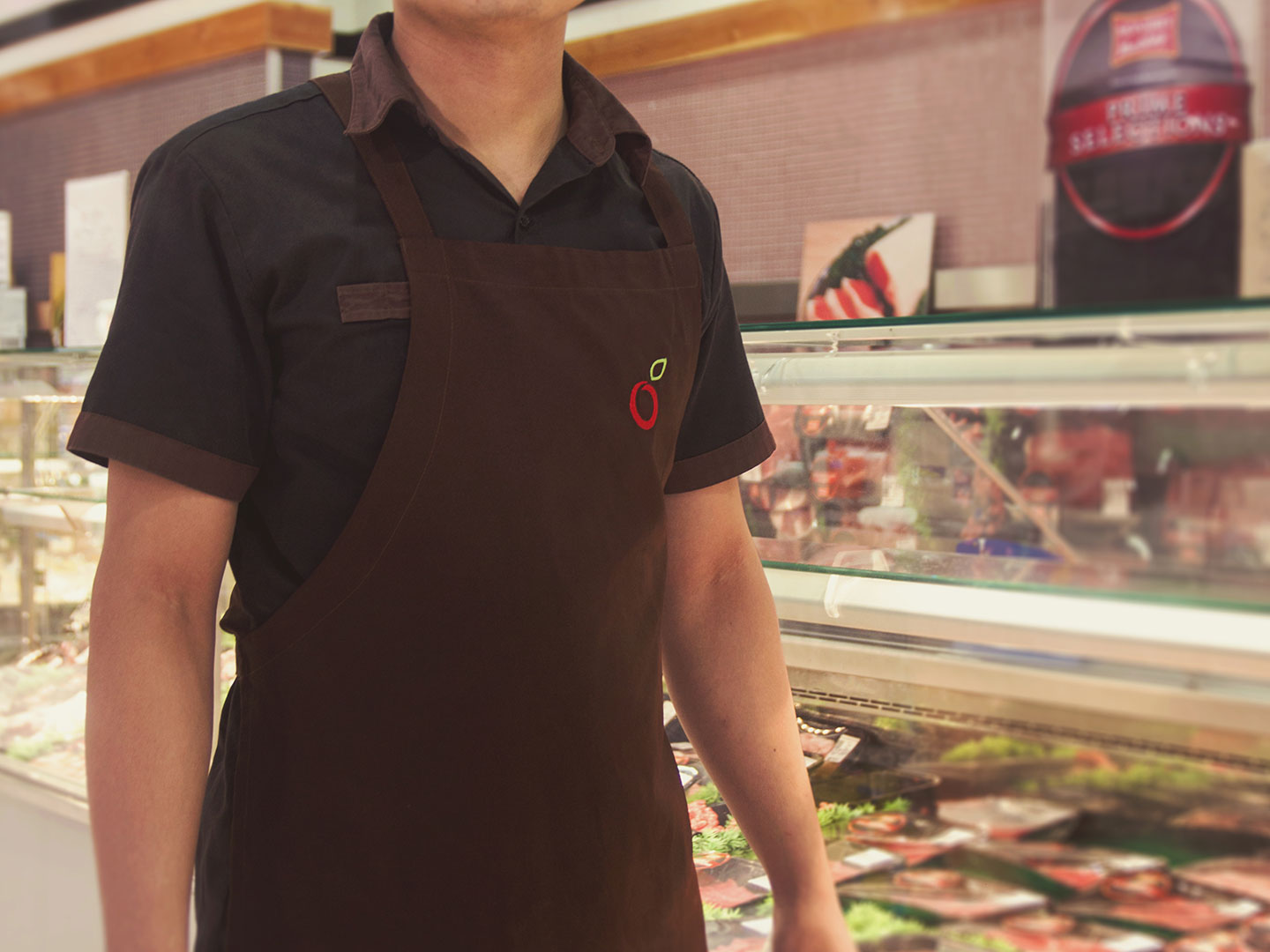
With this idea, we set an overall image that gave Robinsons Selections a unified look that’s premium but not intimidating. The art direction visualized this “carefully-curated” concept which we applied on print, in-store and online. We also designed the logo in alignment with this and used an apple icon reminiscent of its sister company. The warmth of the brand on the other hand, was depicted in the use of hands in the photography.
A promising start
Since its launch last 2014, Robinsons Selections’ Cebu branch was voted two years in a row as the city’s “Best Supermarket” in Sun Star’s Best of Cebu Awards from 2016-2017.
Client
Robinsons Selections
Industry
Retail
Solutions
- Brand Strategy
- Visual & Verbal Identity
- Naming
- Brand Personality
- Tone of Voice
- Logo
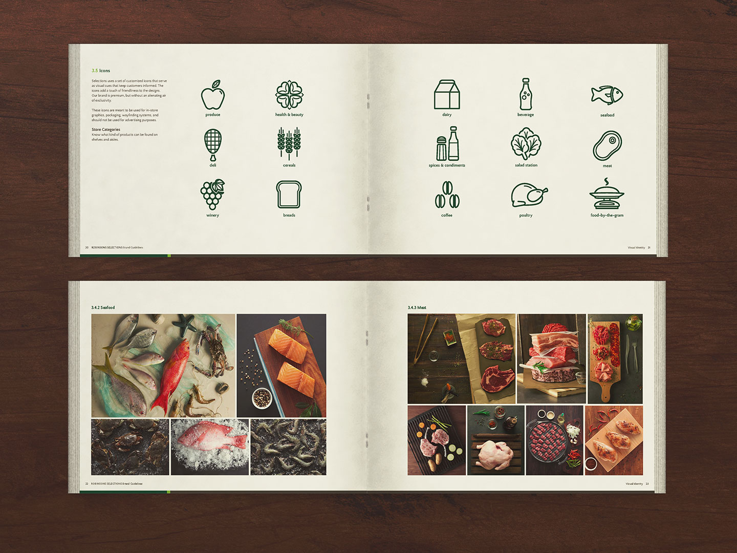
- Icons
- Photography
Share
|
- Design
- Brand Guidelines